Visual Narrative
Route 1 - Lone Wolf
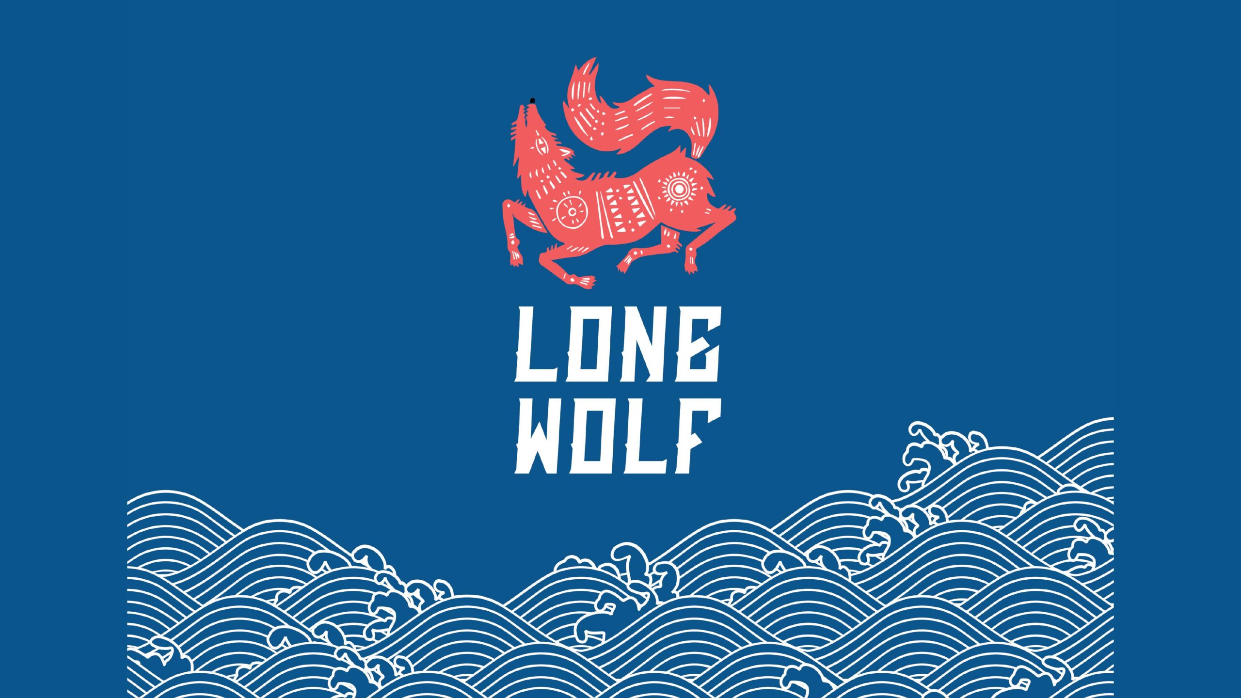
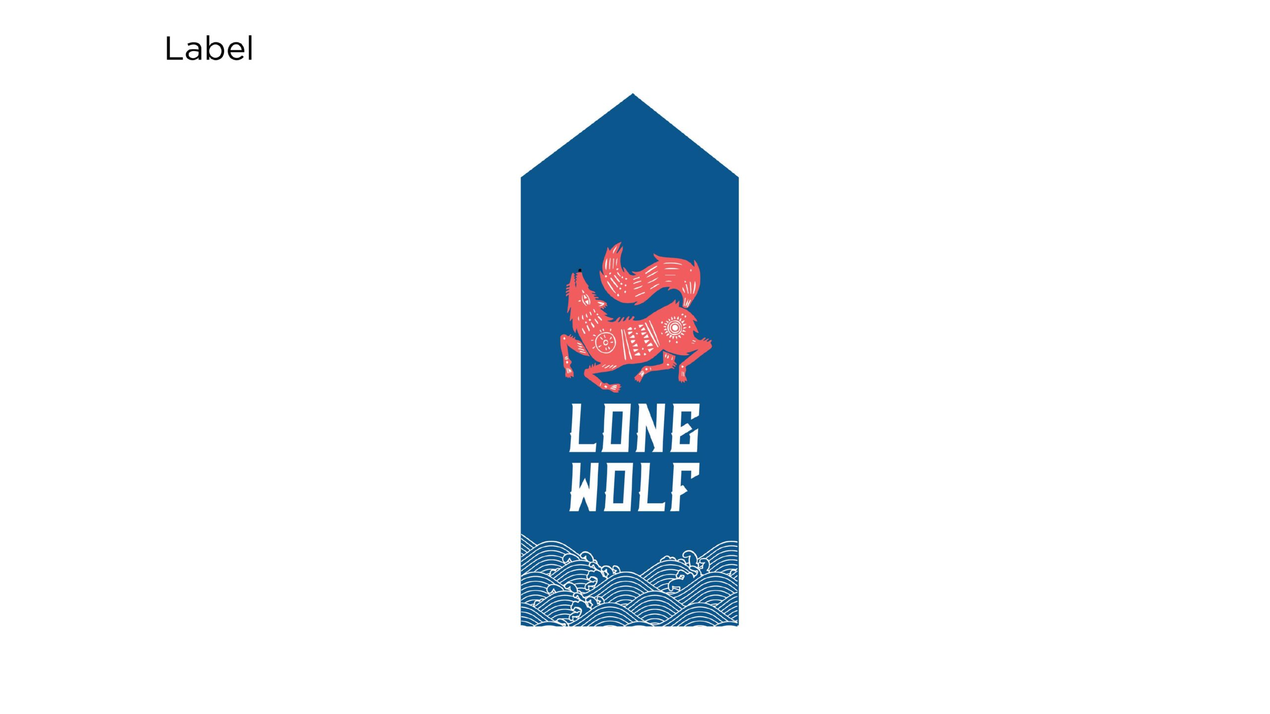
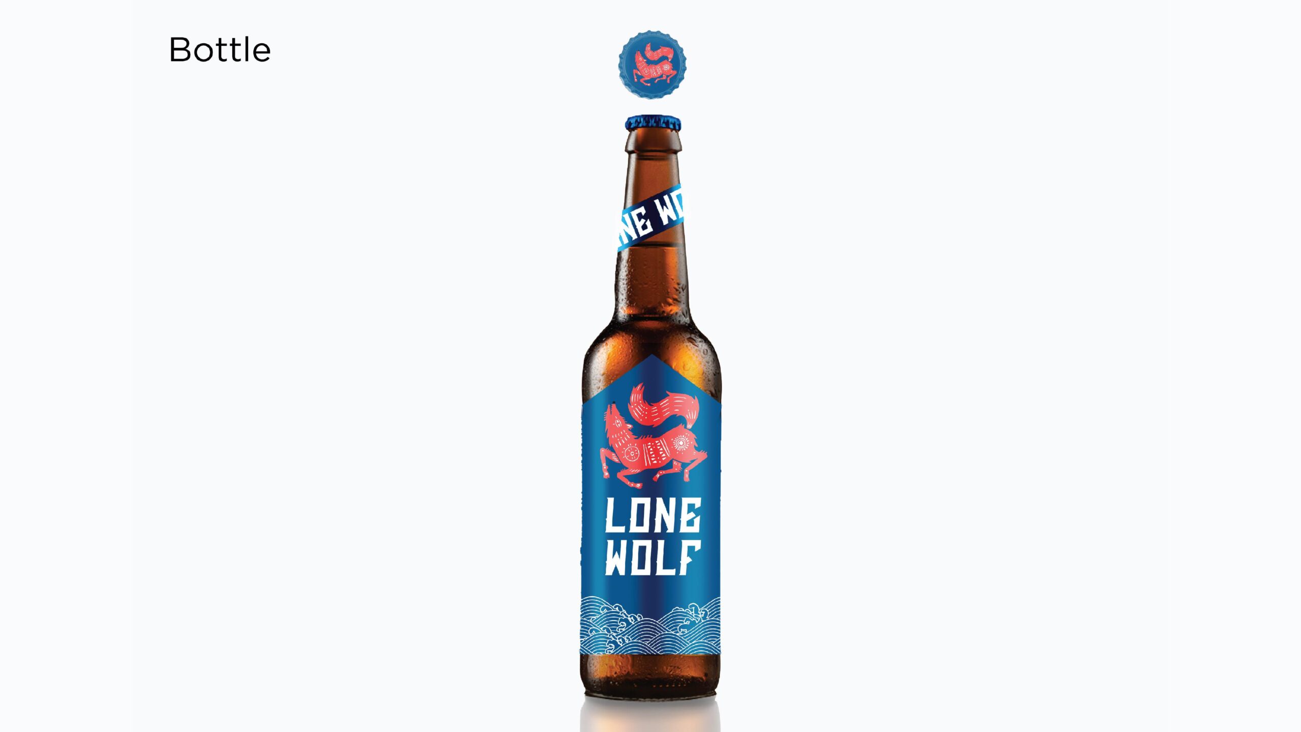
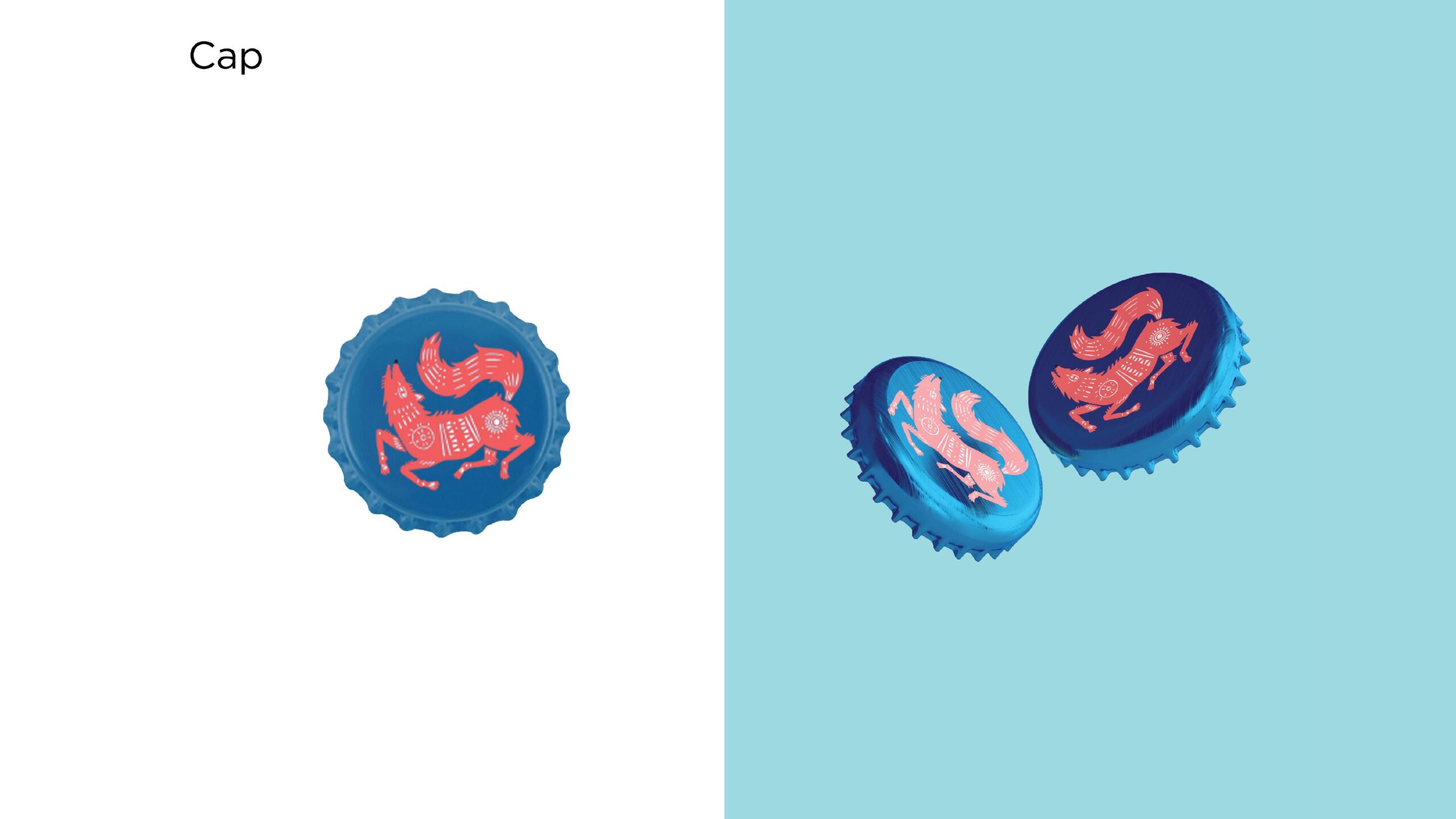
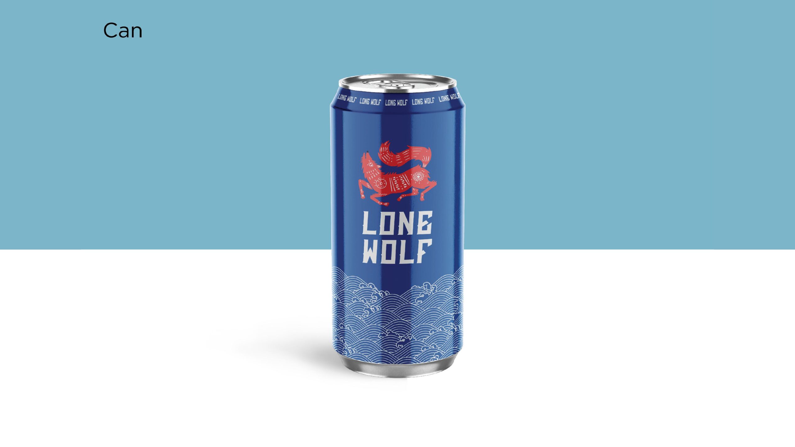
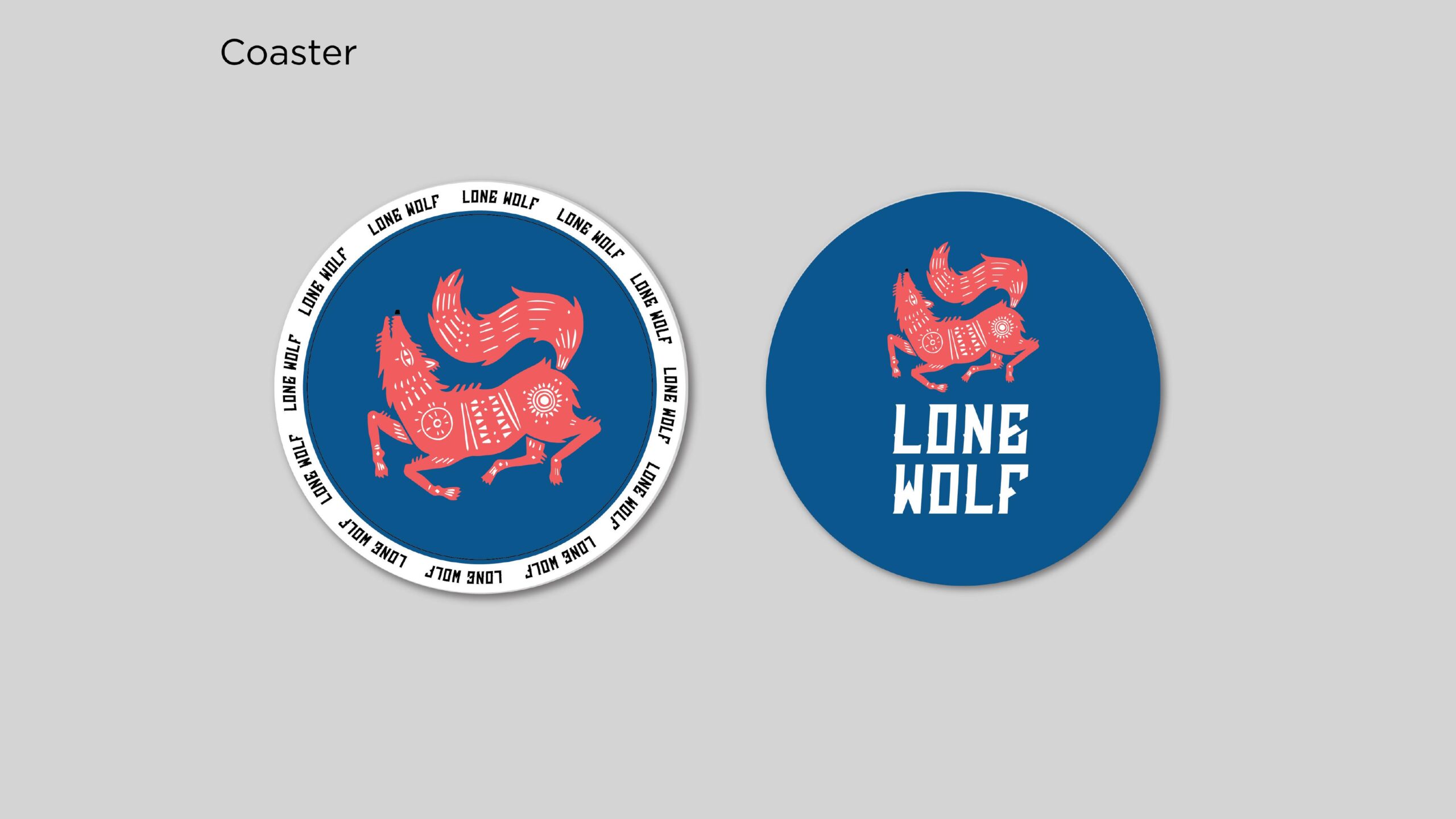
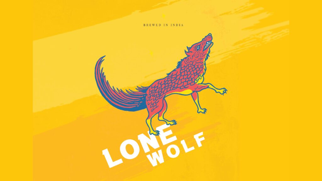
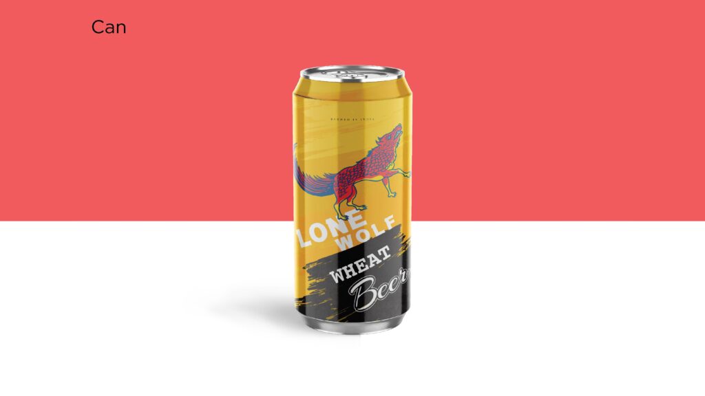
An exploration of using tribal art as a language of storytelling — ancient, raw, and deeply human. This concept reimagines traditional Indian and Aboriginal tribal motifs as expressions of identity and evolution. Each stroke, dot, and pattern becomes a whisper from ancestral memory, merging with contemporary abstraction.
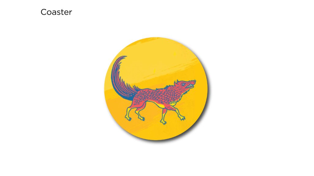
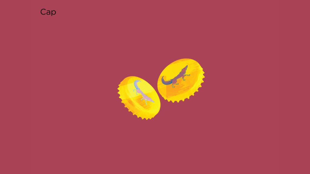
The visual narrative blends symbolic animal forms and human expressions — instinct meeting introspection. The wolf, our protagonist, stands for individuality and the search for belonging. It embodies courage, solitude, and primal intelligence — a bridge between wilderness and self-awareness.
By merging tribal art with modern design grammar, Lone Wolf becomes more than an aesthetic experiment; it’s a cultural dialogue. It speaks of how stories once told by firelight now find expression in digital light, yet retain the same spirit — of survival, strength, and connection.
Ultimately, Lone Wolf is a journey inward — a reminder that even in solitude, there’s rhythm, history, and the unbroken pulse of creation that ties us back to our roots.
Route 2 - Lone Wolf
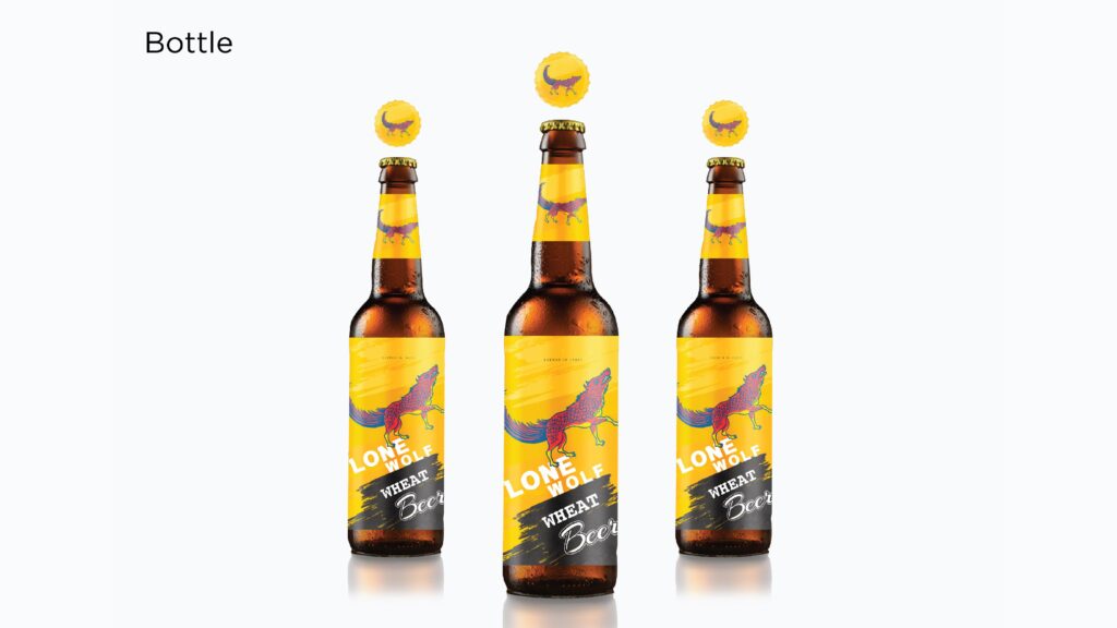
In this route, we aimed to channel the aggression and rawness that define the brand’s core — an unapologetic expression of individuality that stands outside convention. The creative direction embodies an anti-hero archetype — bold, instinctive, and unrefined — someone who doesn’t seek validation but commands attention through sheer presence.
Every visual element — from the color palette to the composition — reflects dominance, originality, and authority, echoing the primal confidence of someone who leads not by conformity, but by conviction.
This route celebrates rebellion as an aesthetic. It positions the brand as a force that’s raw yet deliberate, chaotic yet in control — a symbol of power that isn’t performed, but felt.
Route 3 - Lone Wolf
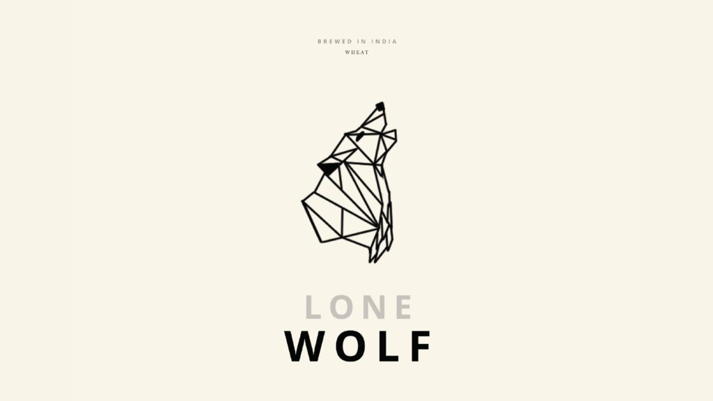
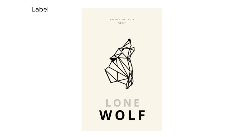
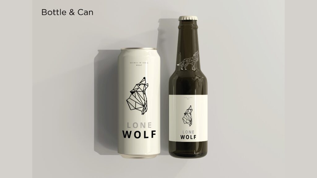
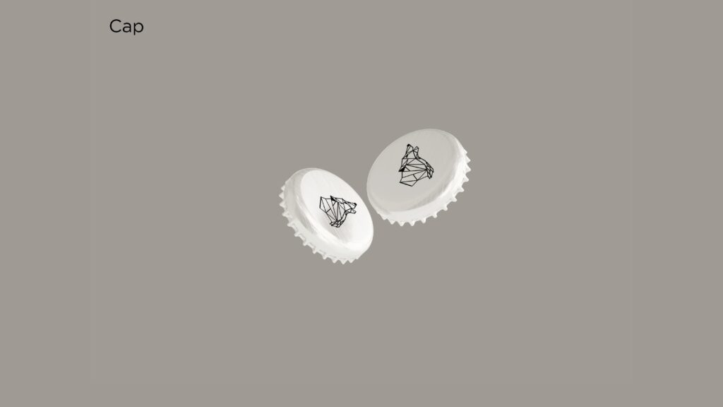
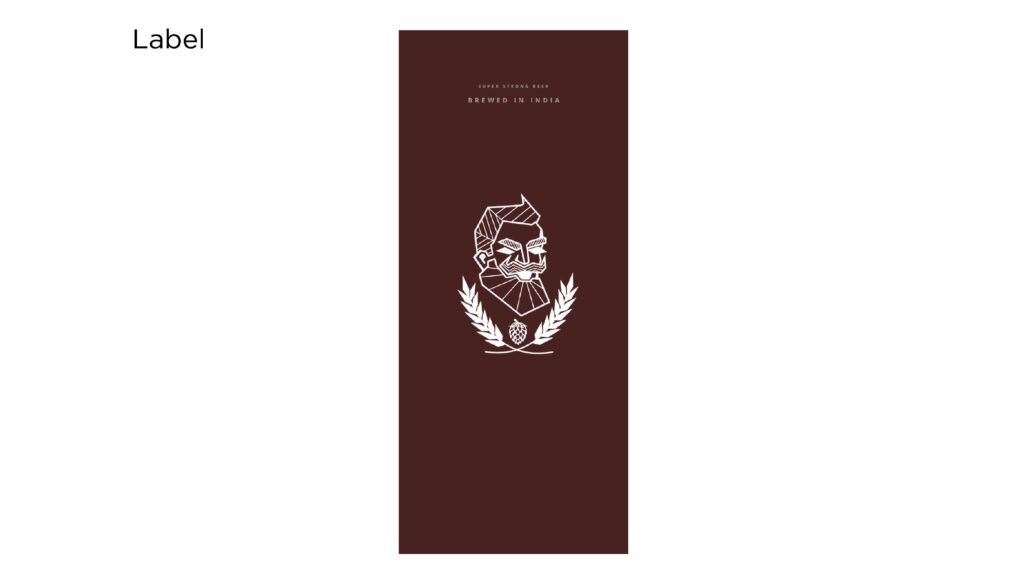
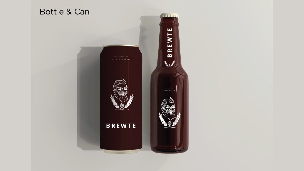
Our third route was an exploration of simplicity and sophistication — a visual philosophy that thrives on restraint. We chose polygon art as the core creative direction, using clean geometry and precise symmetry to build depth without clutter. The idea was to communicate strength and clarity through structure, allowing every line and angle to serve intent and meaning.
Minimalism was our overarching pursuit — saying more by saying less.
This approach distilled the brand’s personality into its purest form: confident, composed, and intelligent. Each polygon became a metaphor for balance — between chaos and control, between art and logic.
Through this route, the brand takes on a refined, futuristic tone, appealing to those who see sophistication not in embellishment, but in precision. It’s where design becomes quiet power — subtle yet commanding, complex yet effortlessly simple.
