Branding - Luxury
Description
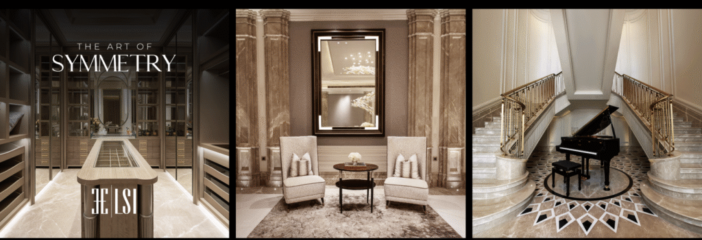
For LSI, luxury isn’t defined by opulence — it’s defined by emotion. Our objective was to reposition the brand as a global symbol of bespoke craftsmanship, where every design narrative transcends décor to become an expression of culture, heritage, and timeless sophistication. The challenge lay in capturing the soul of luxury — not as something displayed, but as something deeply experienced.
We began by distilling LSI’s decades of design legacy into a modern, evocative identity system. The visual language evolved around precision, symmetry, and balance — mirroring the brand’s philosophy of seamless spatial harmony. From typography and textures to tone and palette, every element was deliberately minimal yet grand, reflecting the brand’s duality of global modernism and Indian artistry.

Conclusion
Our creative approach extended beyond visuals to storytelling. We curated brand films, spatial imagery, and digital narratives that invoked a sense of intimacy and aspiration. The communication moved away from showcasing spaces to narrating living experiences — positioning LSI as a design house that doesn’t just build interiors, but sculpts emotions through space, light, and material.
Through a cohesive luxury ecosystem — spanning visual identity, digital presence, and experiential touchpoints — LSI was reintroduced as a thought leader in bespoke interiors. The brand narrative now commands recognition across international markets, bridging craftsmanship with contemporary design sensibility. The outcome: a luxury brand that feels timeless, tactile, and unmistakably human.
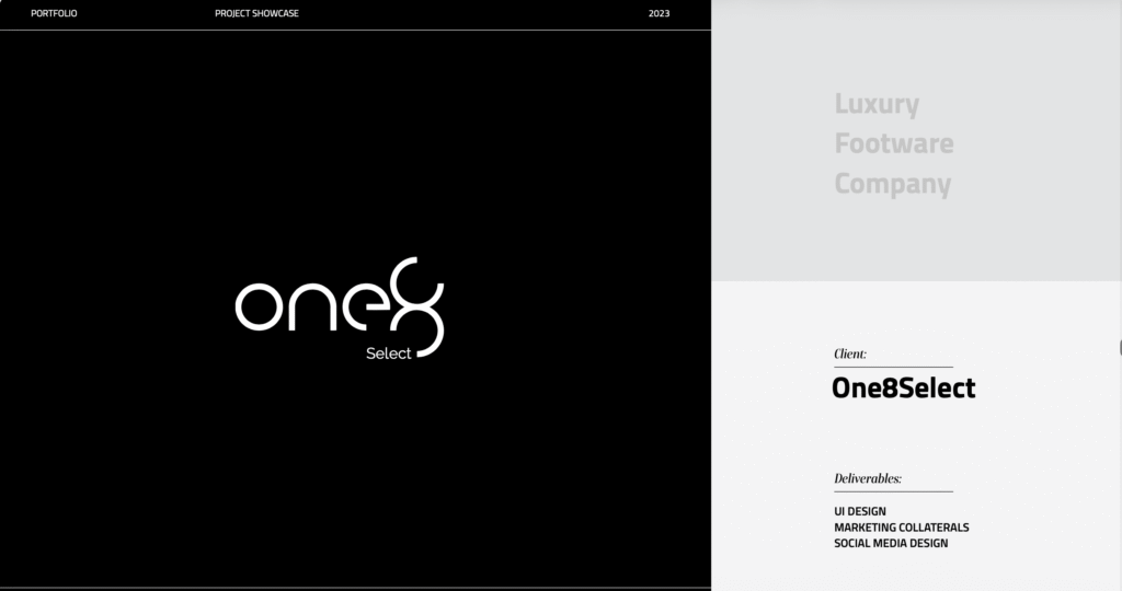
About the Campaign
The One8Select design direction embodies the refined masculinity of a premium lifestyle brand anchored in Virat Kohli’s persona. The branding uses a monochrome-black and gold palette, exuding understated luxury, discipline, and elegance. The logo, sleek yet dynamic, mirrors the brand’s duality—bold performance and timeless sophistication. Every design element, from the typography to the negative space, reflects precision and restraint, much like the man it represents.
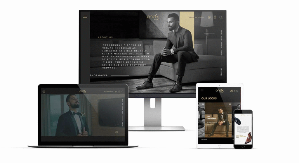
The UI design complements this aesthetic through modern minimalism and cinematic presence. Visuals take precedence—Virat in tailored formals becomes the focal point, conveying aspirational modern Indian luxury. The grid layout, coupled with warm light tones and sharp shadows, positions the website as a digital equivalent of a luxury boutique—exclusive, functional, and fluid across devices.
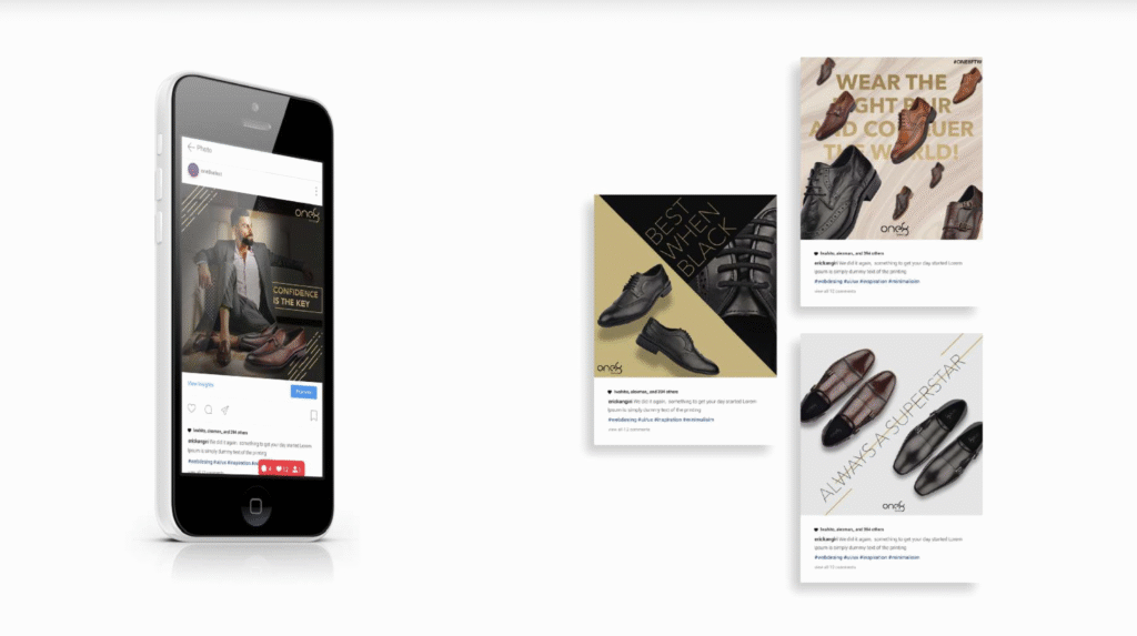
The marketing collaterals and social media designs emphasize the philosophy of “Confidence is the Key.” The compositions rely on strong diagonals, golden gradients, and muted backdrops that make each product feel aspirational yet attainable. Messaging like “Your Best Foot Forward” and “Always a Superstar” translate the core brand idea—power dressing as performance psychology—into a visual and emotional experience.
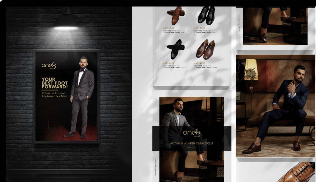
Together, the integrated brand ecosystem for One8Select captures the intersection of fashion, ambition, and craftsmanship. Whether on a billboard, digital screen, or mobile device, the design ensures a cohesive, high-impact identity that reinforces One8Select as India’s benchmark for luxury footwear with purpose and presence.
SLOOP
A luxury fashion brand
The Concept
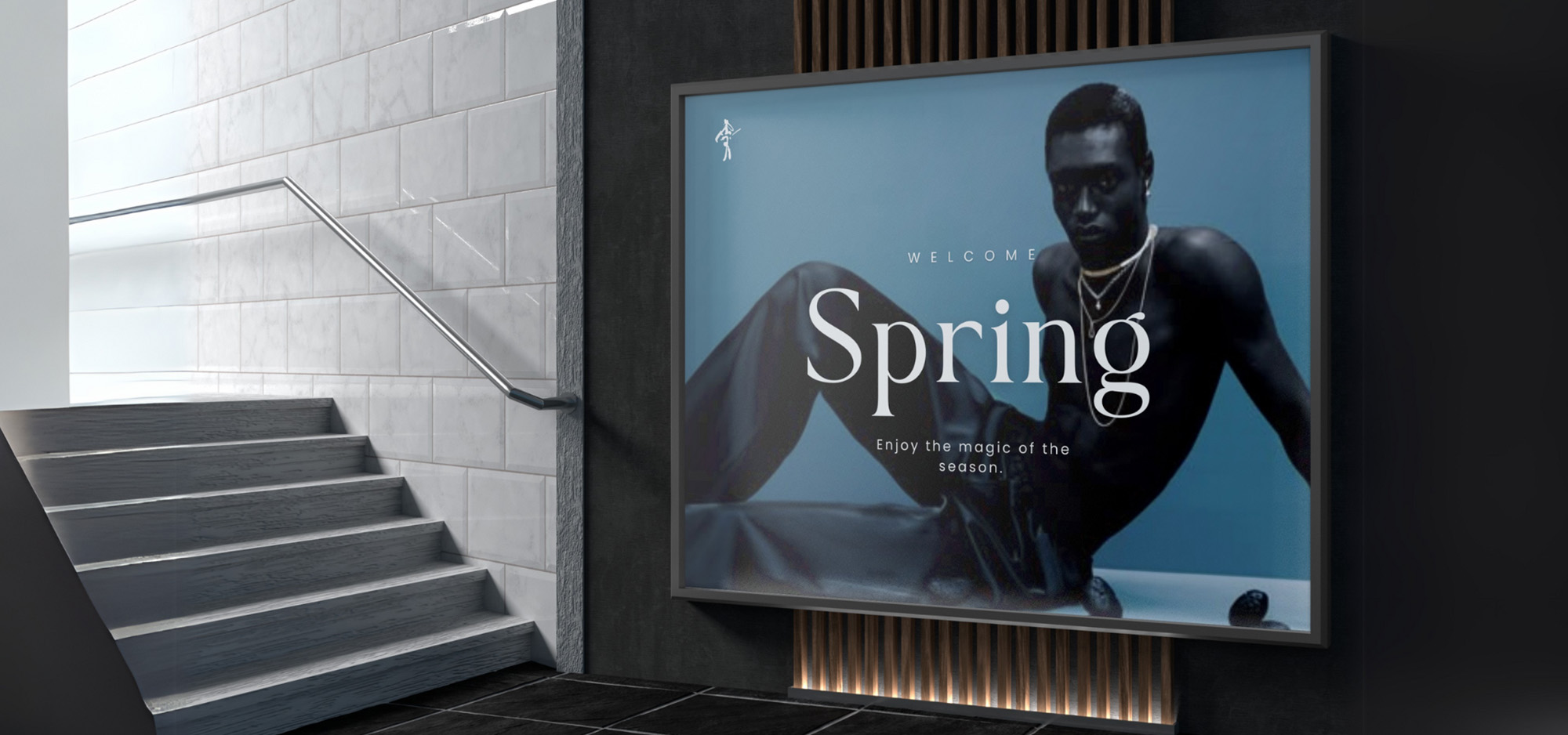
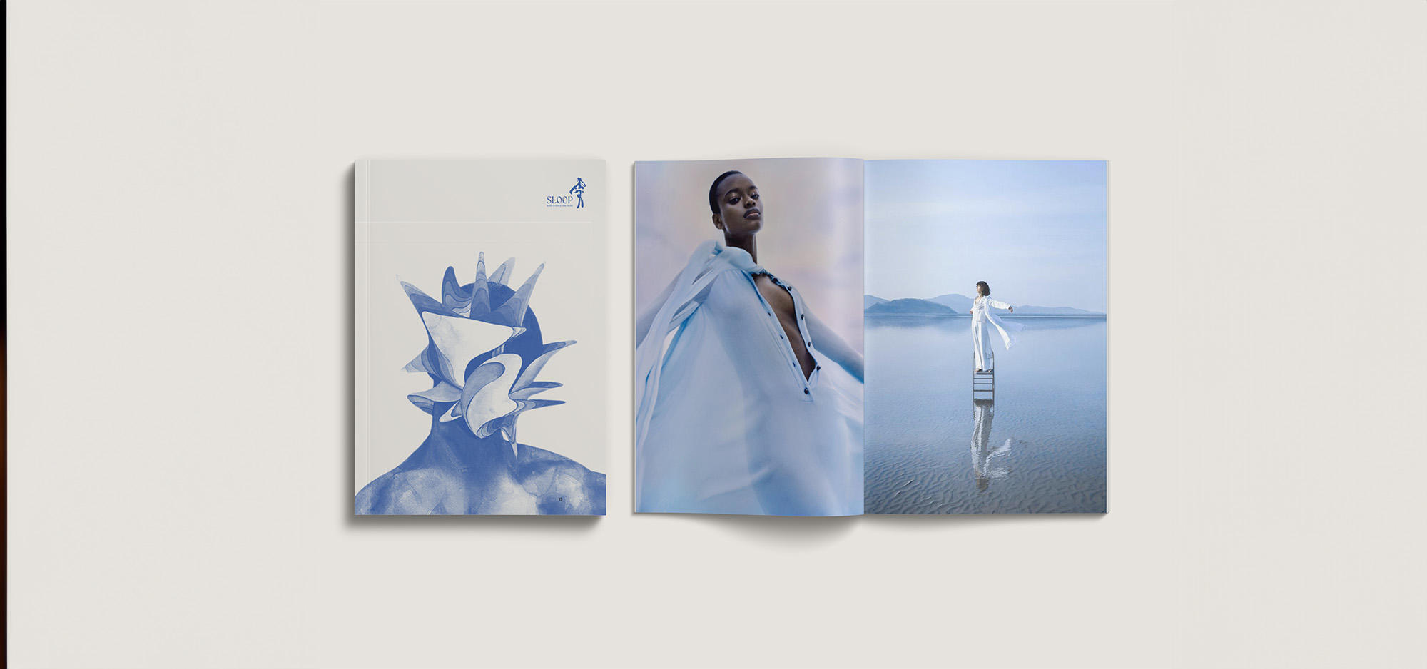
Sloop is a contemporary slow fashion brand rooted in Japanese minimalism and Indian craftsmanship. Inspired by the Japanese idiom Oubaitori- which celebrates individuality and natural rhythm- Sloop offers thoughtful, fluid essentials that champion quiet confidence and self-expression. The brand stands as a movement for intentional living, emotional depth, and cultural harmony, designed to evolve with its wearer.
The Problem
In a saturated slow fashion market, Sloop wanted to establish a distinctive, emotionally resonant identity that stood apart from seasonal or trend-driven competitors. The founders had a powerful philosophy and aesthetic vision. They needed guidance for crafting a cohesive brand strategy, identity system, and storytelling approach that could reflect their values and translate across platforms.
The Solution
To bring Sloop’s philosophy to life, we approached the project as a deep cultural and emotional translation.. We began by articulating a clear brand strategy-defining its purpose, values, audience, and positioning in the slow fashion space. The core idea was to create a brand that doesn’t define the individual, but adapts to and celebrates their uniqueness.
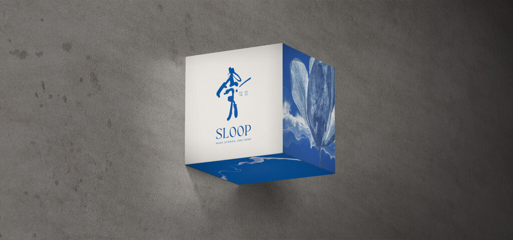
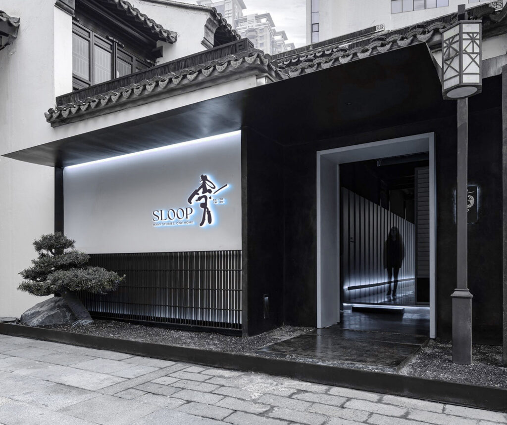
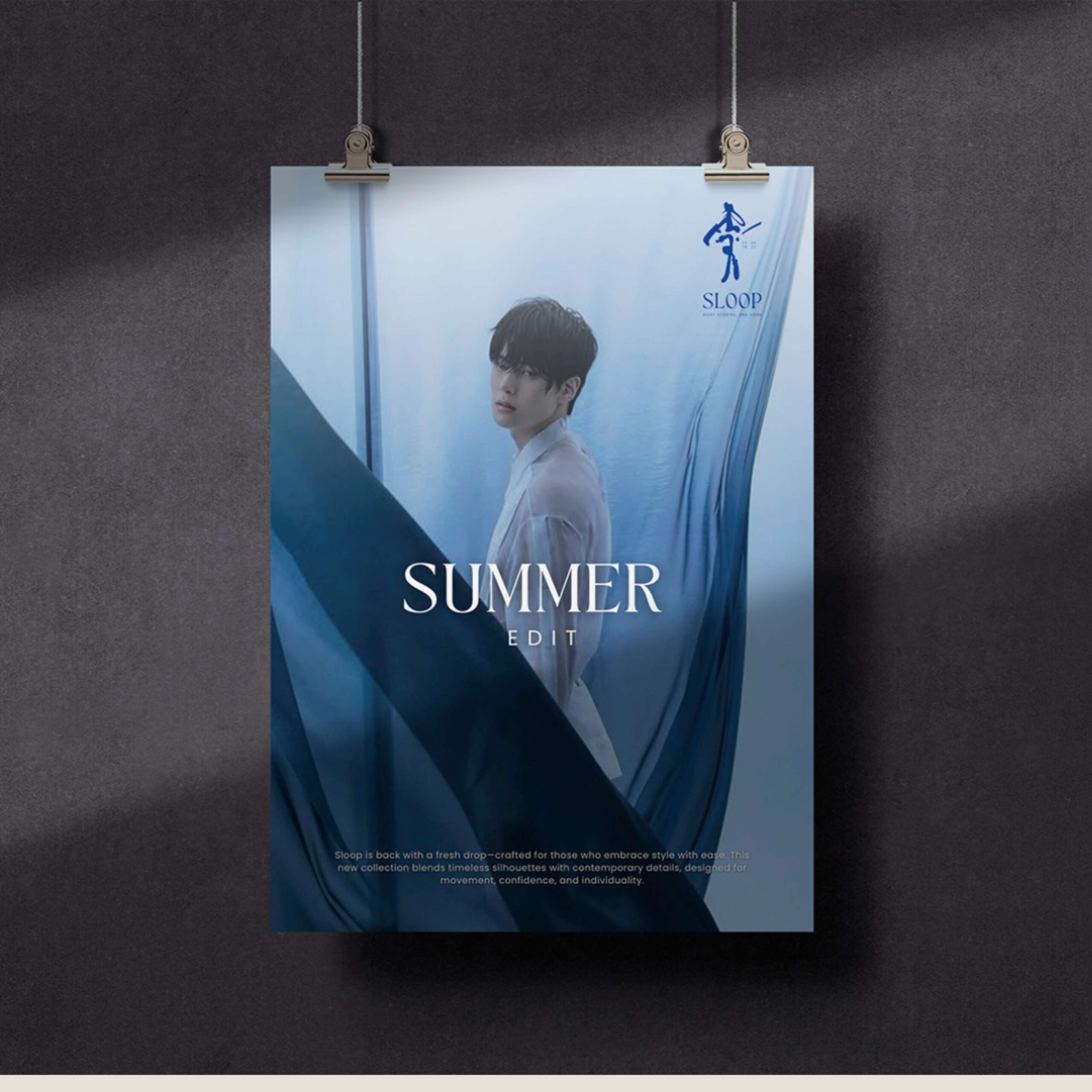
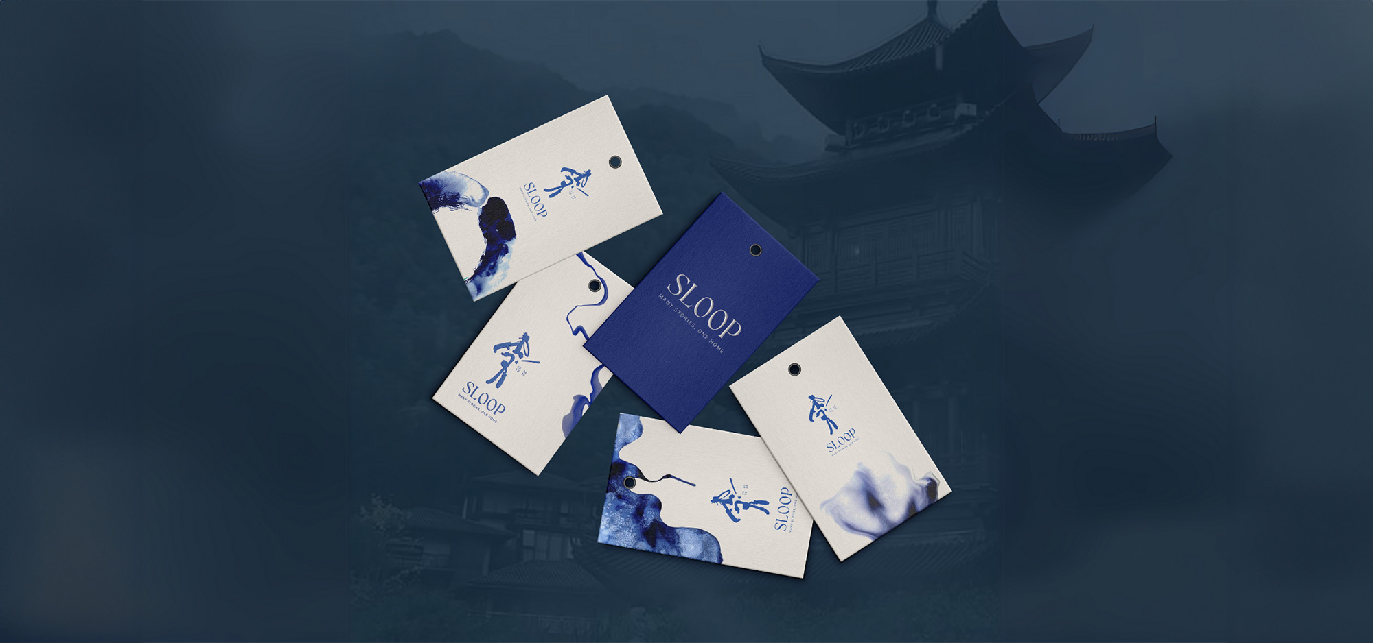
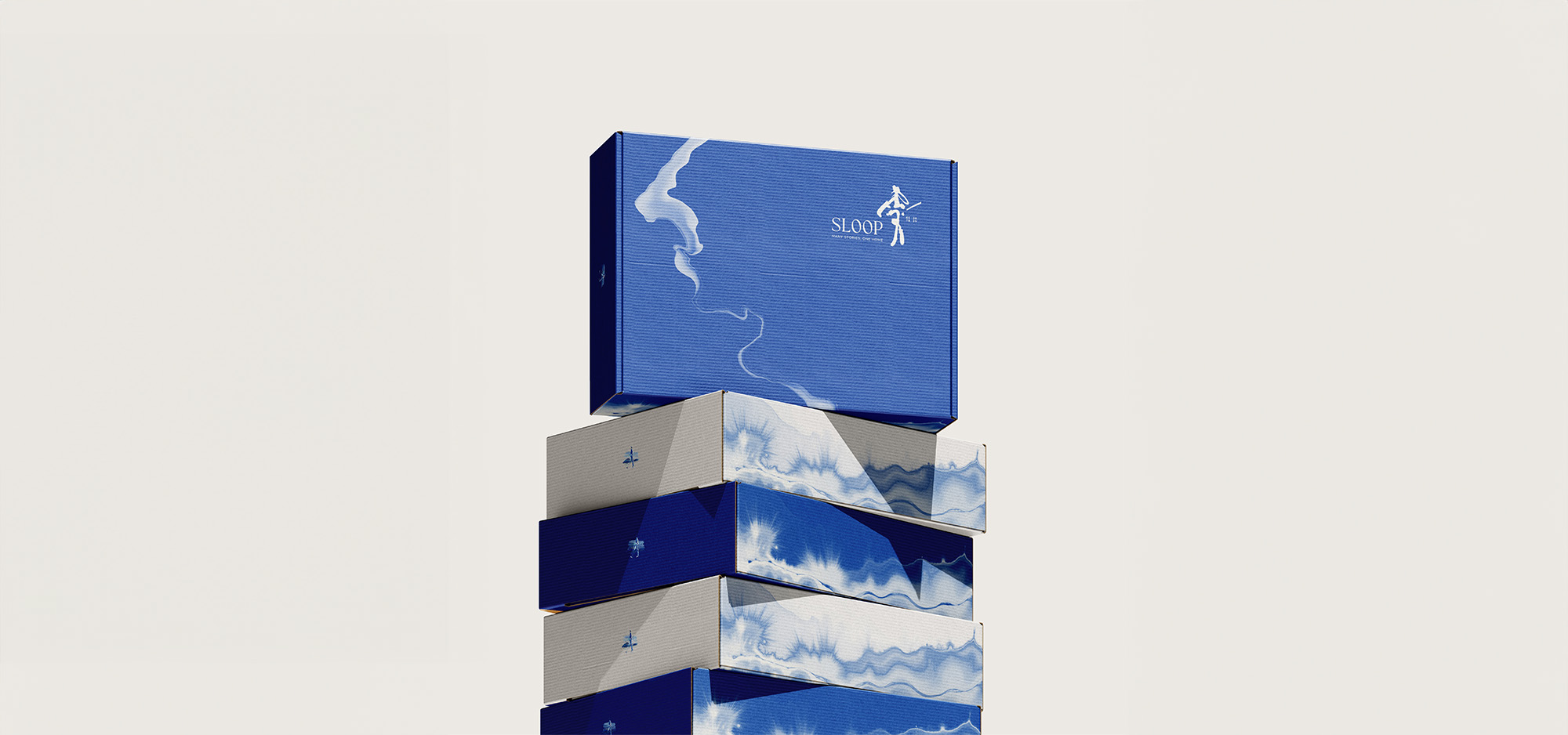
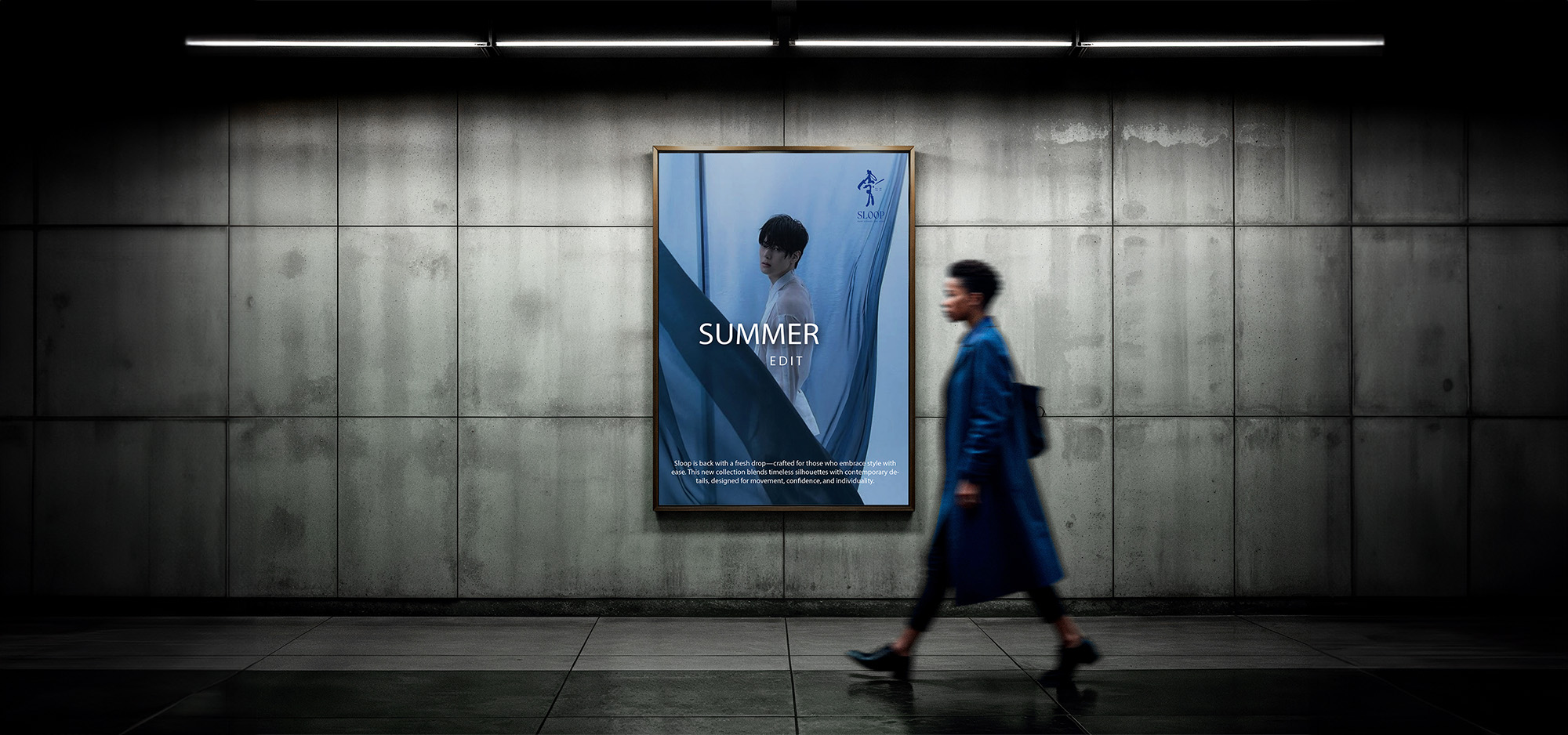
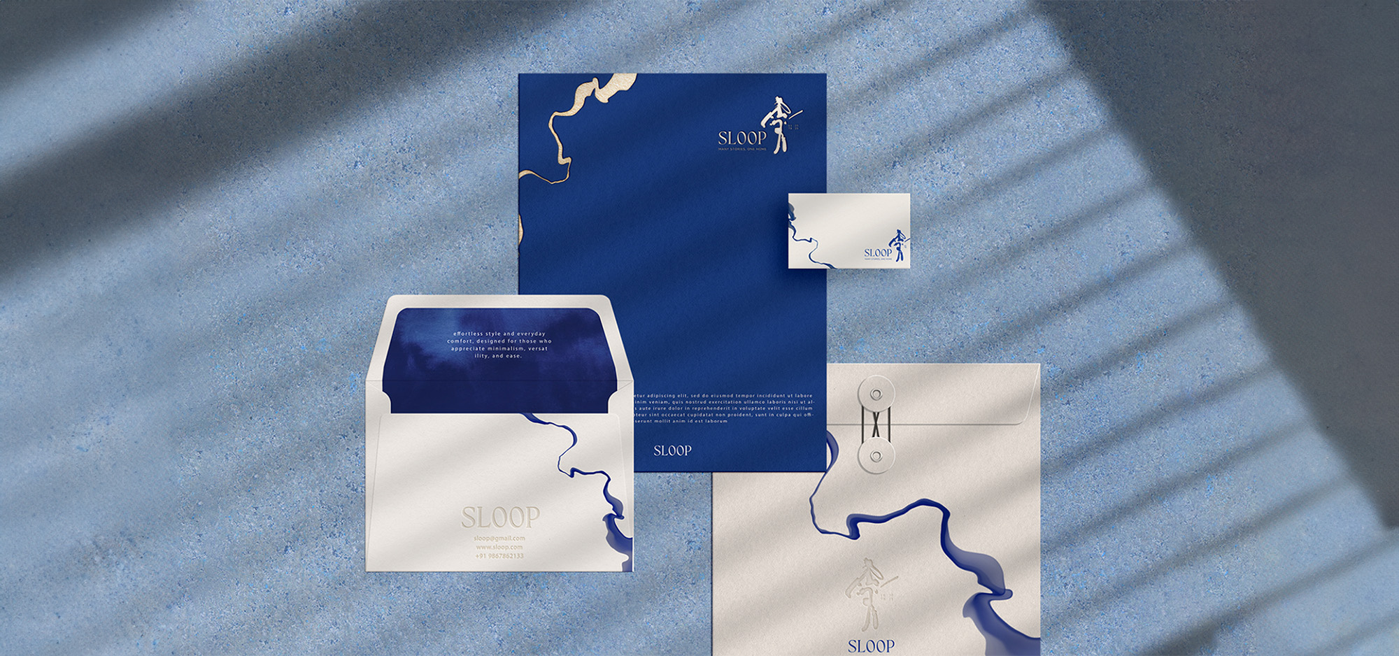
Visually, we developed a fluid, minimal identity inspired by both Japanese aesthetics and Indian artisanal traditions. The logo- an abstract brushstroke- symbolises movement, openness, and the confluence of cultures. A custom typography system blended Japanese and Devanagari calligraphic cues, while the colour palette balanced Japanese restraint with Indian richness through earthy tones and a signature deep blue.
Beyond the aesthetics, we created a cohesive visual and verbal system that was modular, inclusive, and emotionally resonant. Organic forms, hand-drawn textures, and non-binary representations allowed Sloop to stand out as a gender-functional, expressive brand. The brand was extended across all key touchpoints- from packaging and social media to launch assets and content guidelines- ensuring consistency, flexibility, and depth in storytelling.
Sloop’s branding journey, now globally featured on the World Brand Design Society, reflects our belief that powerful brands begin with meaning. We didn’t just give Sloop a look- we gave it a voice, a soul, and a future-ready foundation.

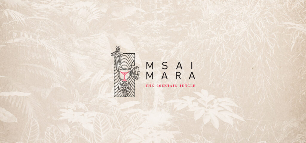
MSAI MARA
Msai Mara is a multi-cuisine restaurant located in Faridabad. The restaurant has a very welcoming & natural ambience as the interiors are inspired by the elements of flora & fauna.
The Concept
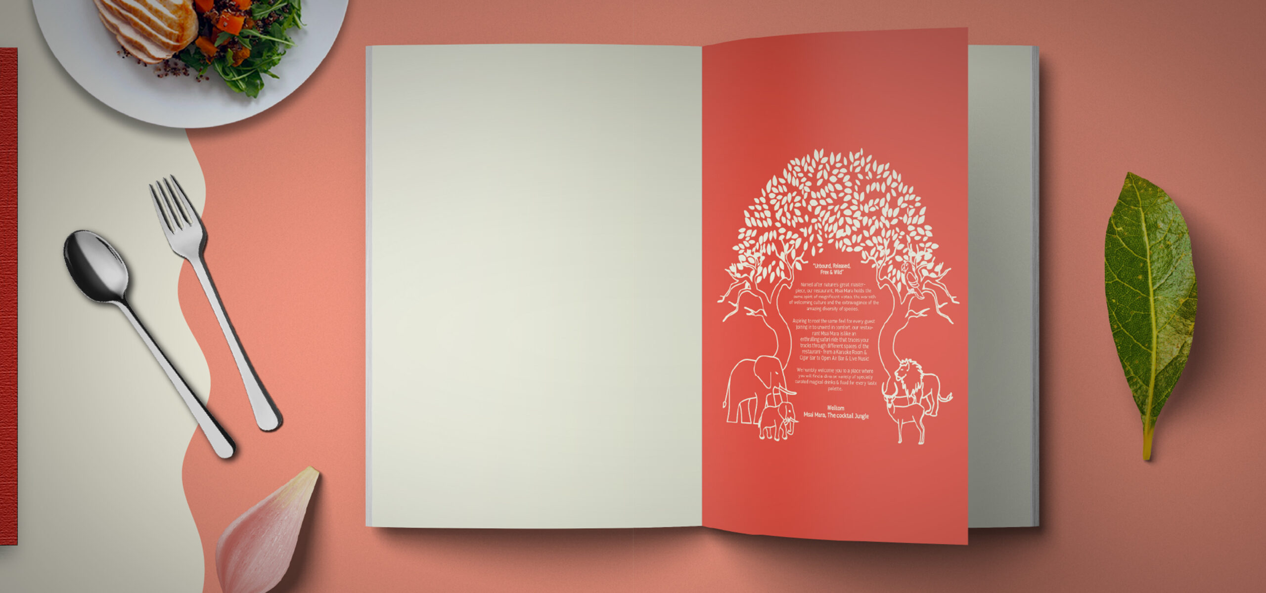
Drawing inspiration from the majestic Masai Mara National Park in Kenya, our concept artfully weaves together elements of flora and fauna to create a captivating brand identity. By infusing the essence of this renowned national park, we successfully crafted a visual identity that encapsulates the vibrant colours, rich culinary traditions, and cultural heritage of Masai Mara. the branding for the restaurant was thoughtfully designed to reflect this inspiration, creating an immersive experience that truly embodies the spirit of the national park.
Problem Identification
Despite having finalized the restaurant’s brand name and interior design, the client encountered an unexpected challenge just weeks before the launch. They discovered that another lounge shared the same name, necessitating an urgent rebranding effort. As a result, the client required not only a new brand name but also a completely fresh brand identity to swiftly establish their unique presence in the market.
The Solution
Brand Name:
The name “Msai Mara” was chosen, drawing inspiration from the renowned Masai Mara National Park nestled in the preserved savannah areas of Kenya. The name proved to be an impeccable fit for a premium restaurant that sought to embody the essence of nature’s beauty with its captivating flora and fauna ambience.
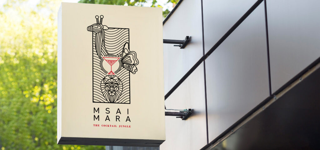
Brand Logo & Pattern:
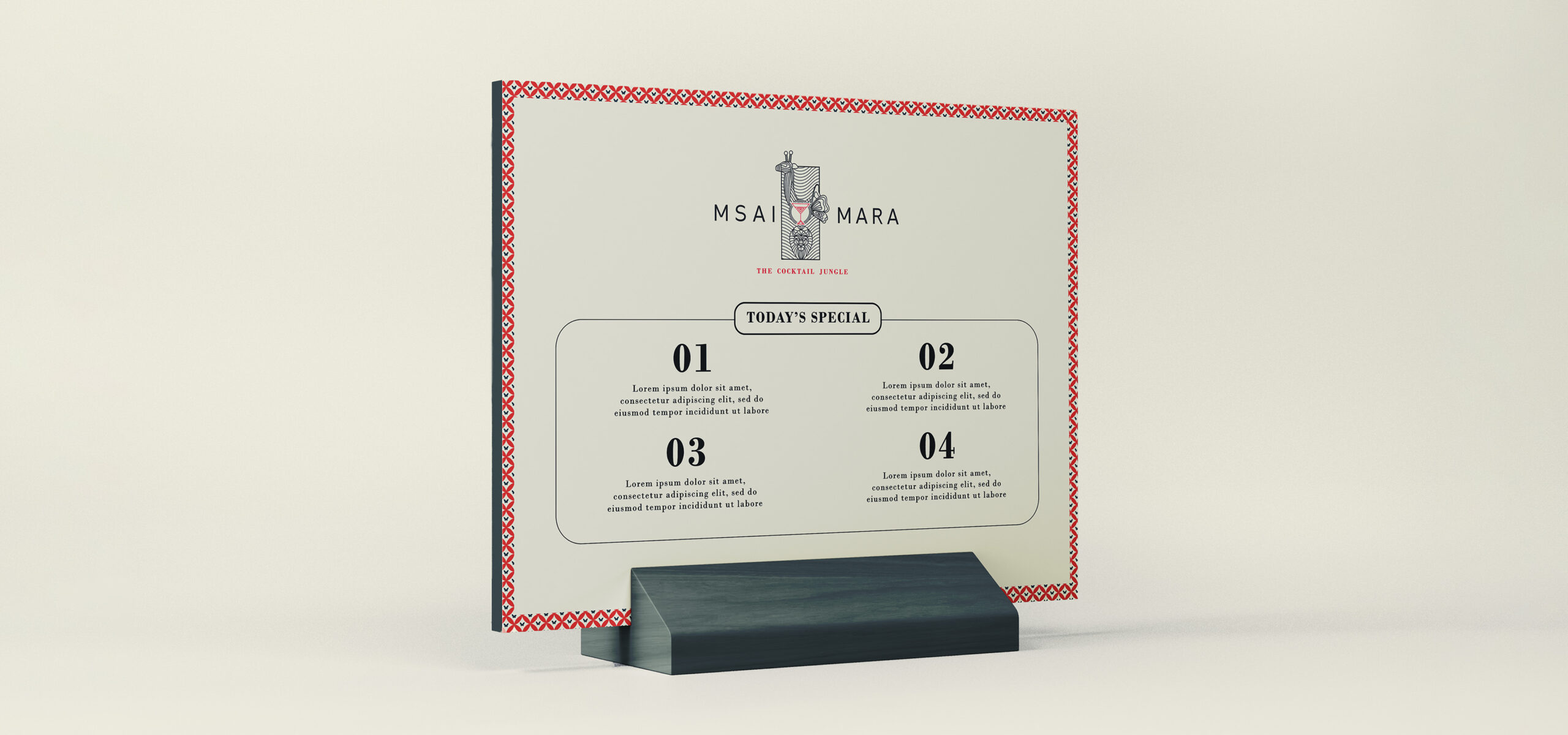
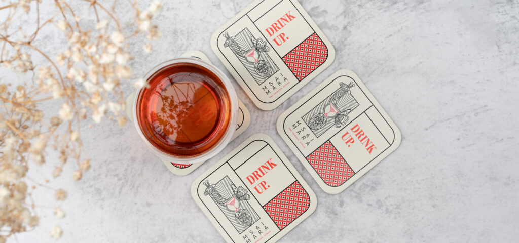
When it came to designing the brand logo and pattern, our focus was to create a visual representation that aligned seamlessly with the brand name and captured the essence of the business.
With a clear communication objective in mind, we curated distinctive silhouettes of a giraffe, lion, butterfly, and cocktail glass, each holding its unique significance.
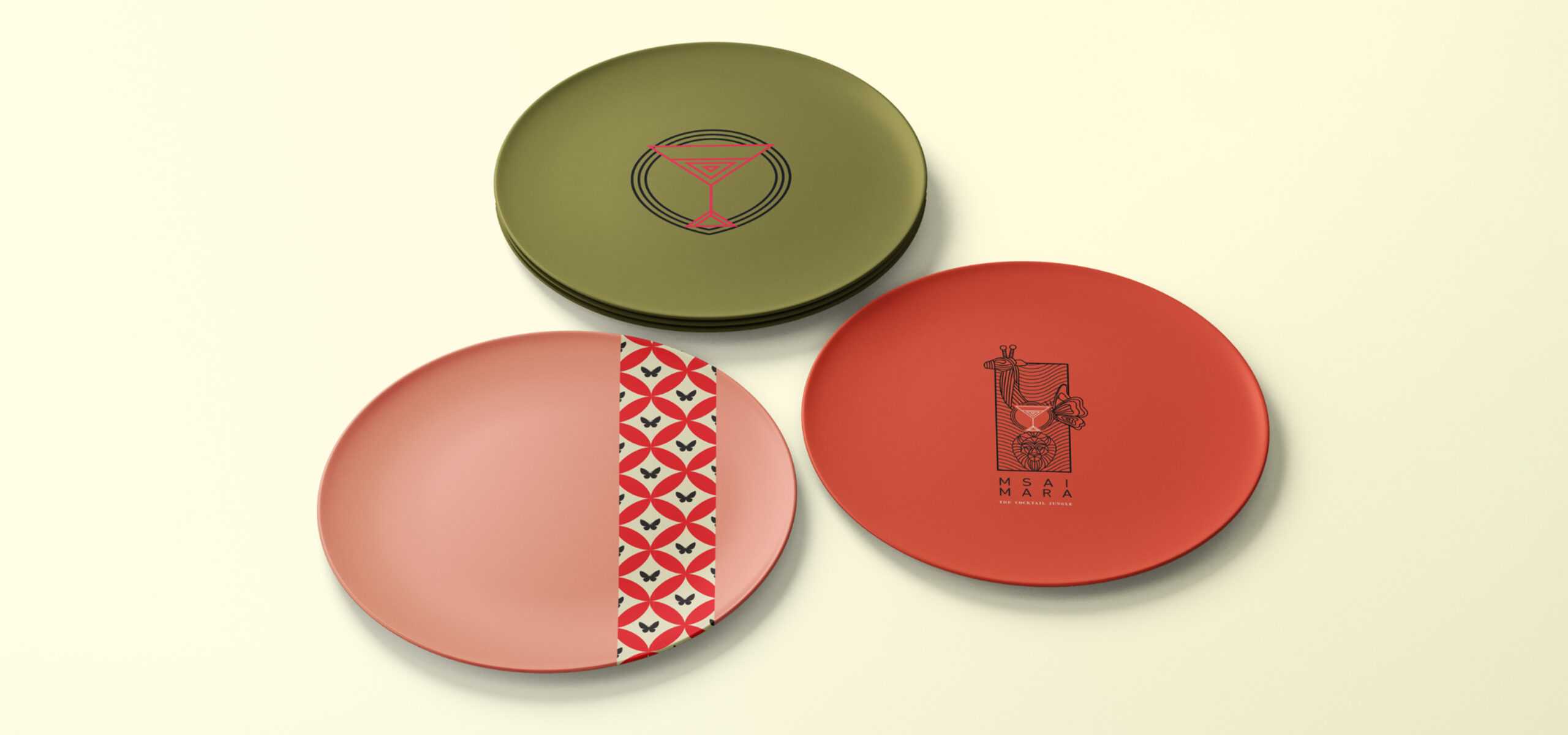
The brand patterns encompassed four key elements:
Butterfly Pattern: Utilizing the butterfly motif from the logo, we opted for a vibrant red colour to ensure its prominence within the restaurant’s bustling interiors.
Cocktail Glass: This pattern aimed to reflect the nature of the business, symbolizing the restaurant’s expertise in serving delightful beverages.
Circular Colored Pattern: Drawing inspiration from the colours and patterns prevalent in Masai Mara’s culture, this design evoked a sense of authenticity and cultural richness.
Line Graphic Pattern: This design showcased the vastness and grandeur of the magnificent Masai Mara National Park while also representing the wide array of food and beverage choices offered by the restaurant, Msai Mara.
By thoughtfully crafting these logo and pattern elements, we achieved a cohesive visual identity that harmoniously captured the essence of the brand and its unique positioning.
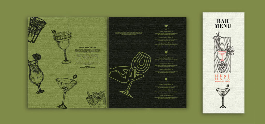
Brand Tagline: The Cocktail Jungle
Given the distinctiveness of the brand name and its captivating story, we aimed to create a tagline that effectively communicated the essence of the business. Our objective was to ensure that the tagline succinctly conveyed the nature of the restaurant’s offerings.
Brand Collaterals:
The brand collaterals were meticulously crafted to embody the entirety of the brand concept. From the vibrant cutlery design to the chic uniform designs, each collateral element served as a distinct and memorable point of contact with consumers. Our objective was to create collateral materials that not only differentiated the brand but also left a lasting impression on the minds of customers.
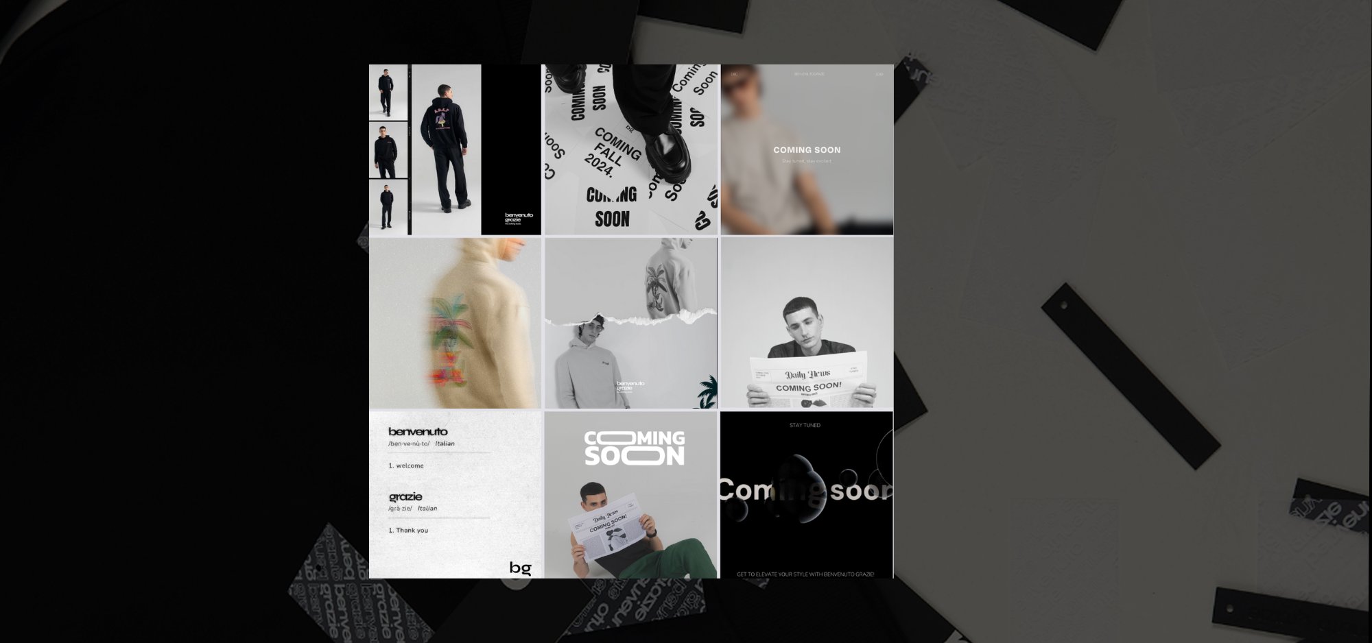
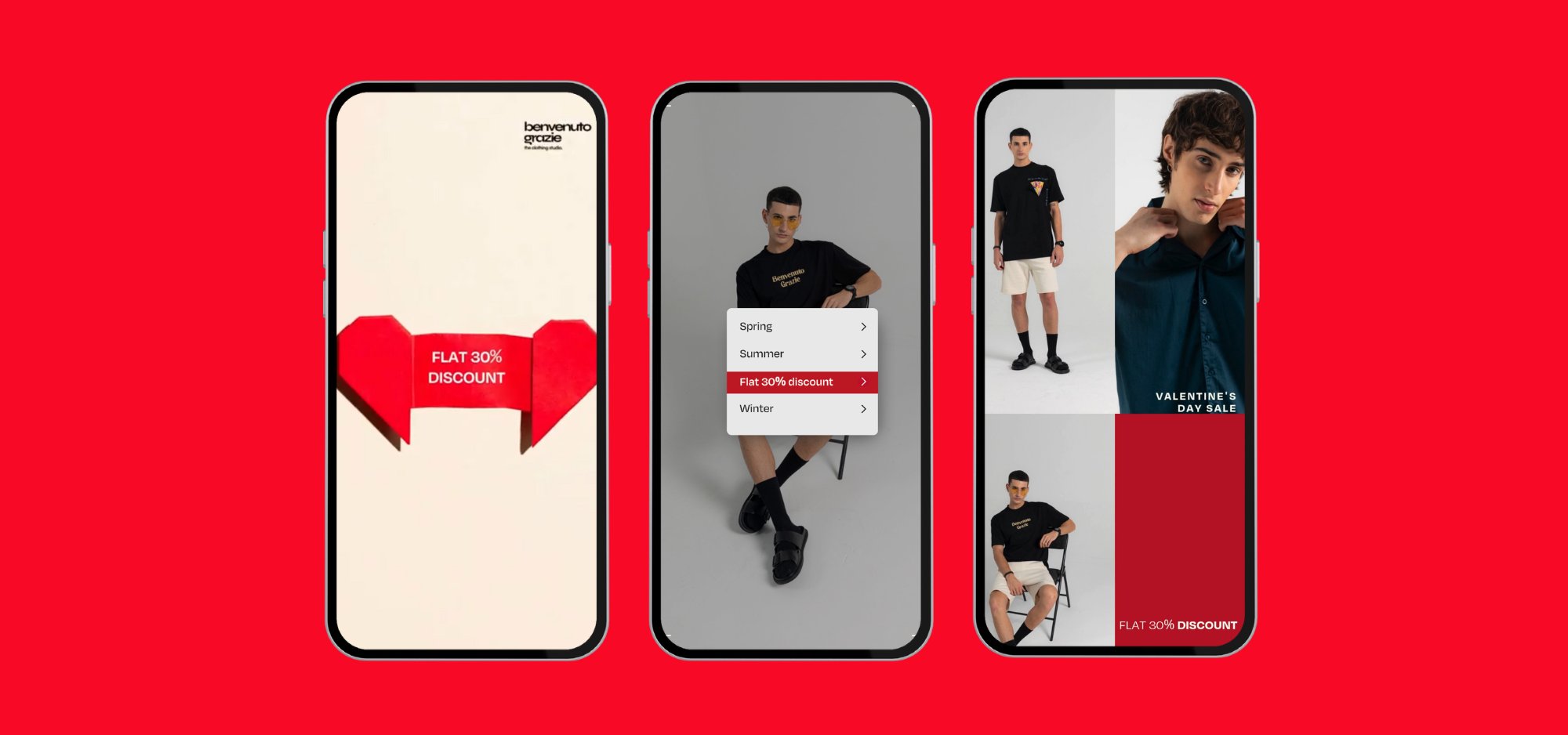
Benvenuto Grazie
UK-based men’s streetwear brand rooted in street culture with a luxury undertone.
The Concept
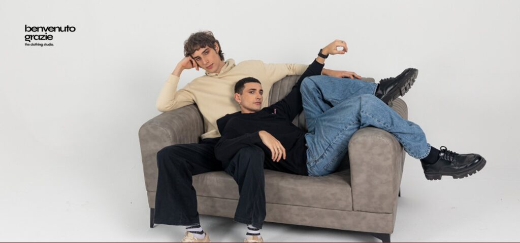
Benvenuto Grazie is a UK-based men’s streetwear brand that blends urban edge with refined tailoring- a label that celebrates modern masculinity with bold, confident essentials. The brand voice is unapologetic, fashion-forward, and rooted in street culture with a luxury undertone.
Problem Identification
The brand had a powerful aesthetic and product range and needed a consistent and strategic social media presence that reflects this. It needed content that not only reflected its bold personality but also positioned it as a serious player in the premium streetwear space- all while building engagement and community in a highly competitive UK fashion market.
The Solution
We focused on:
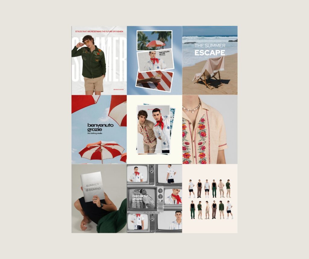
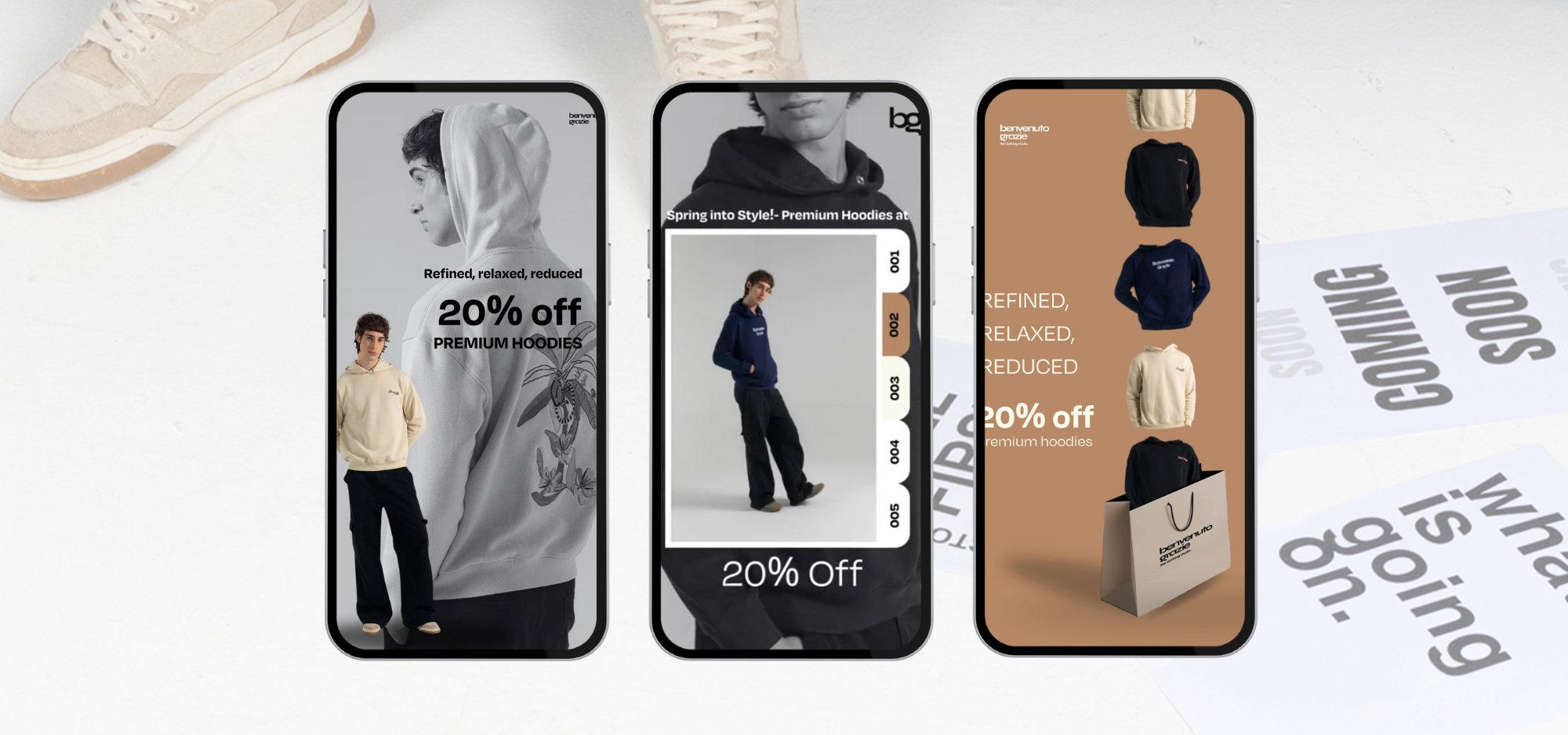
– Visual Identity: Creating a mood board-driven feed that combines high-contrast visuals, layered textures, and minimalist layouts.
– Content Strategy: Developing a mix of product drops, styling edits, brand storytelling, and cultural references that align with the brand ethos.
– Tone of Voice: Bold and direct- always aligned with the street-luxury vibe.
– Community Engagement: Implementing hashtag strategies, interaction protocols, and brand alignment to boost reach and resonance.
From reels and campaigns to everyday content, we built a grid that feels both curated and raw, mirroring the very essence of Benvenuto Grazie. The result: a growing digital presence that attracts the right audience and reflects the attitude, aesthetic, and ambition of the brand.
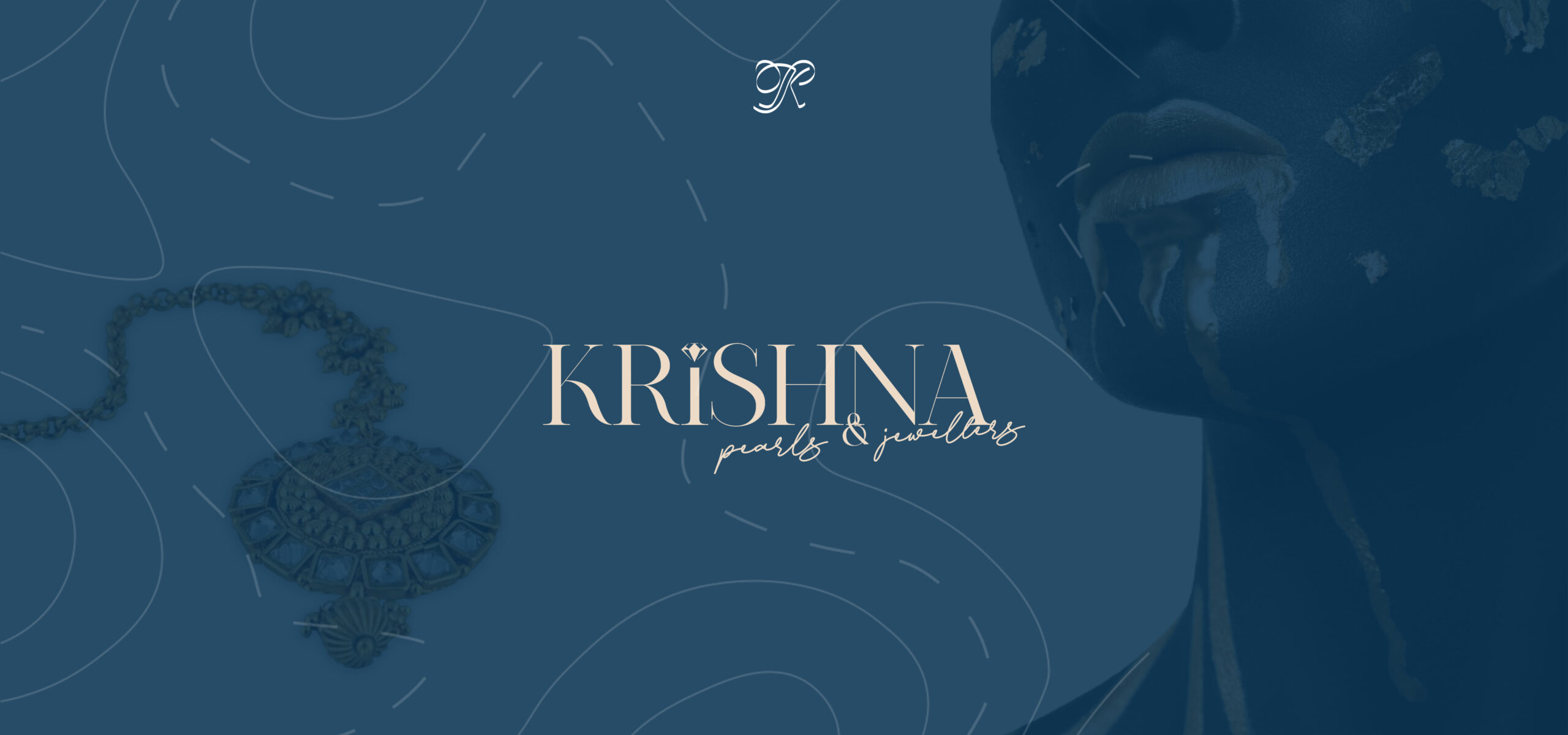
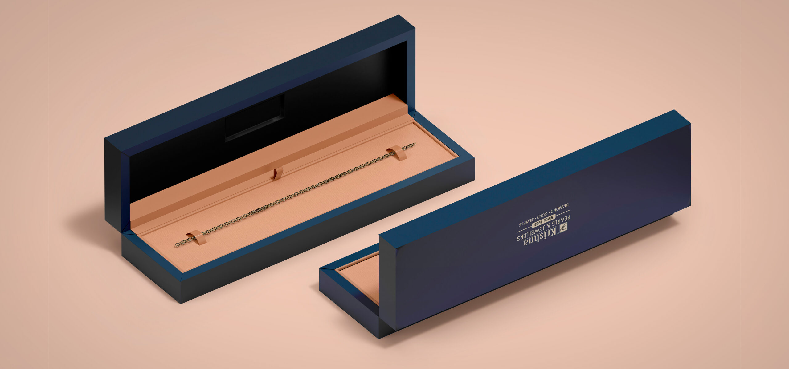
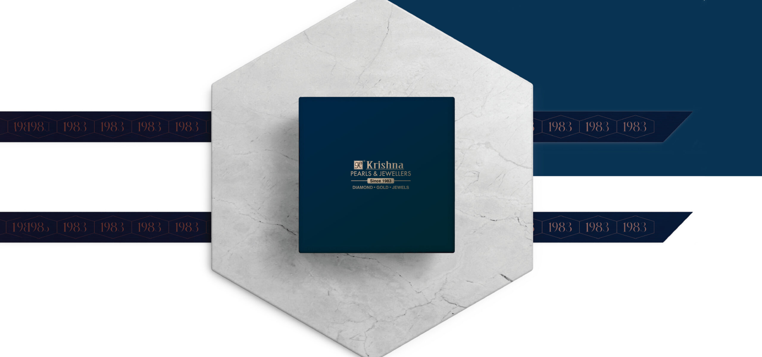
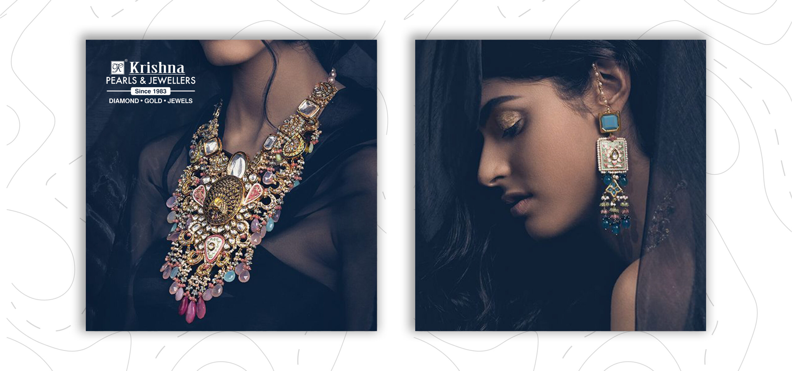
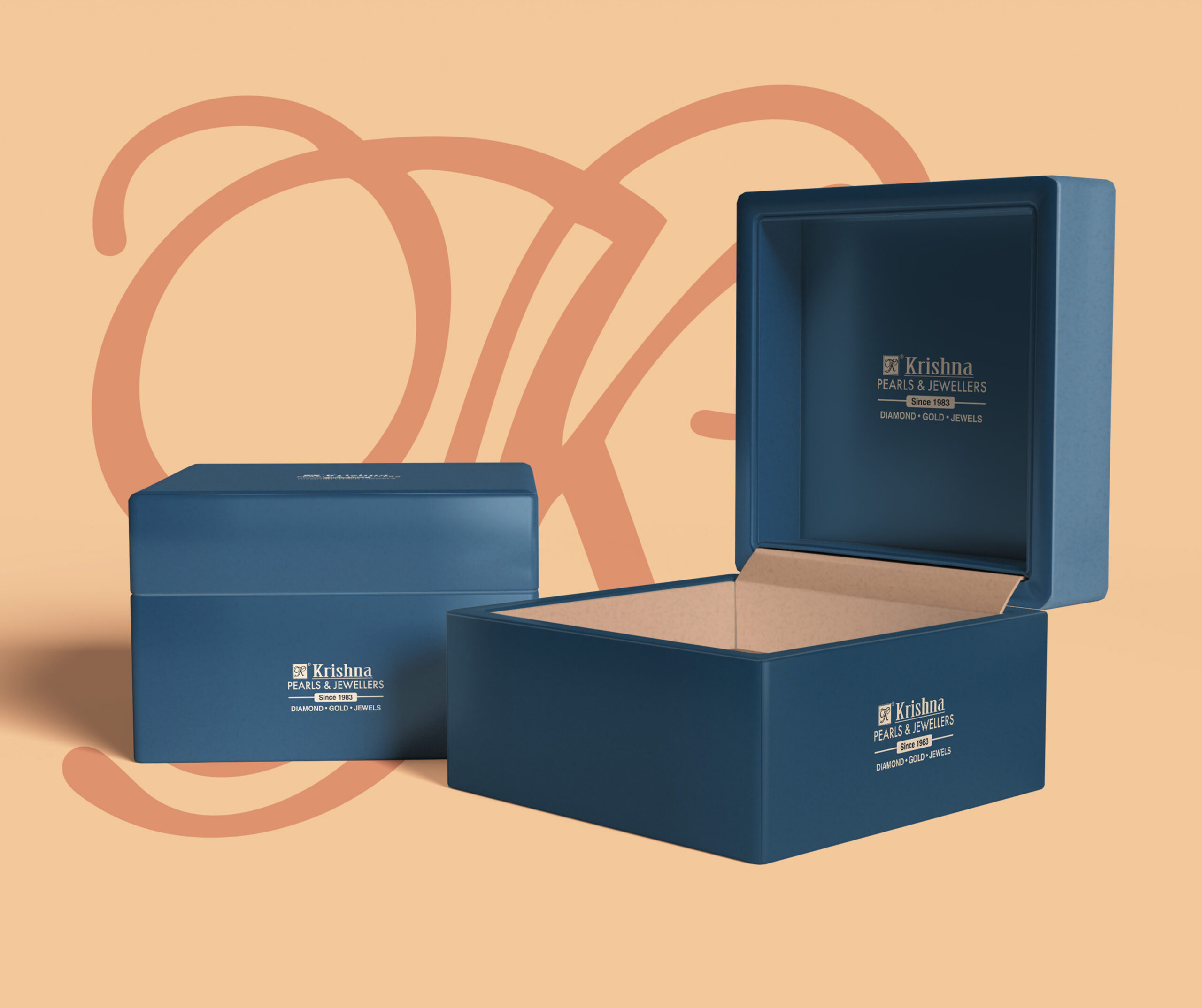
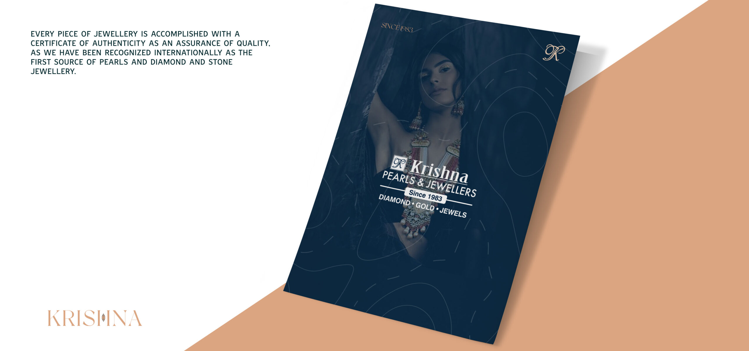
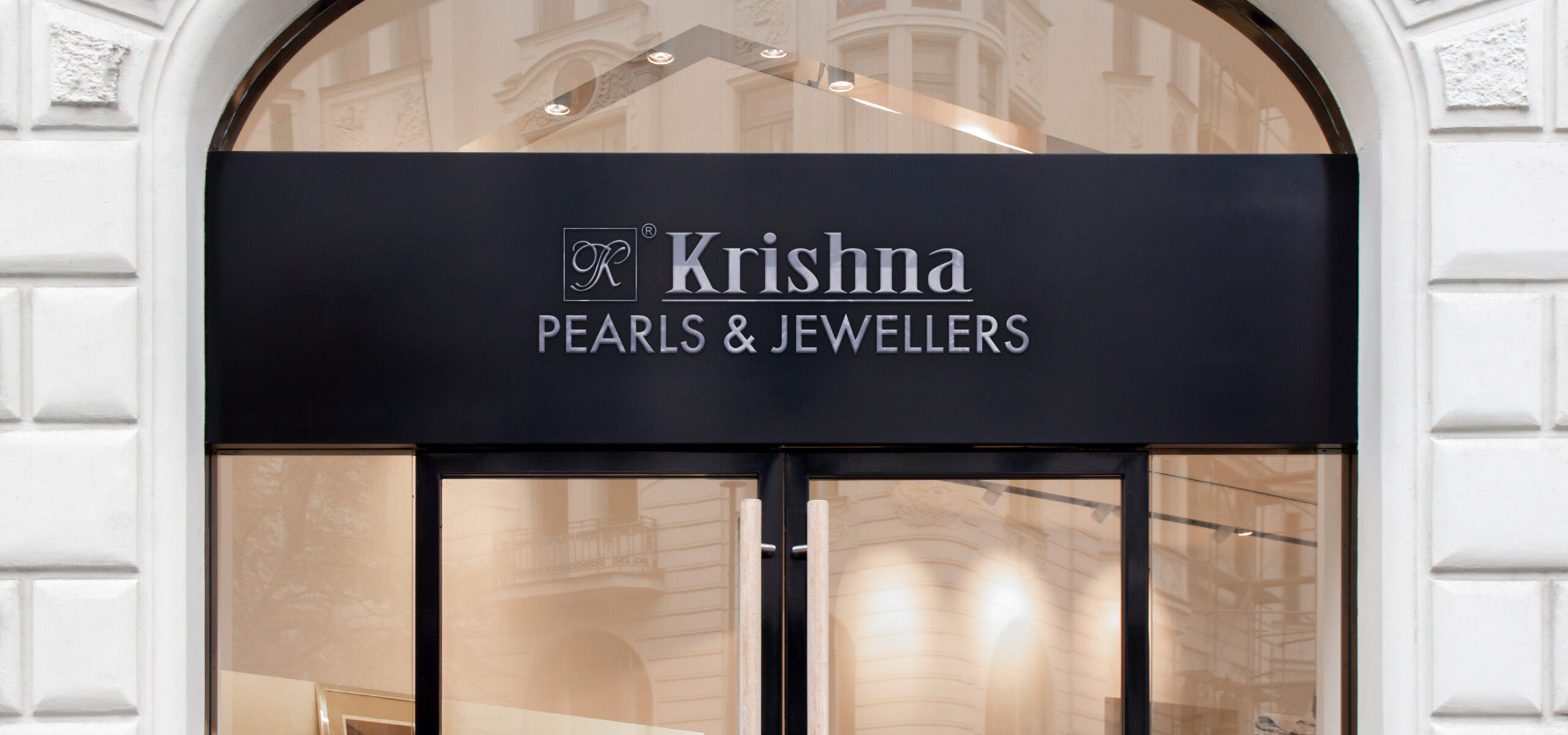
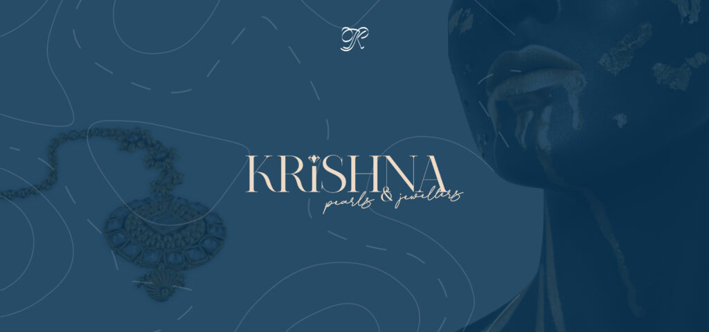
Krishna Pearls & Jewellers
A fine jewellery brand which is a treasure trove of heritage & modernity, with exceptional expertise in Pearl Jewelry. Their jewellery is a work of art in its entirety.
The Concept
The brand’s essence echoes the spirit of Hyderabadi heritage, and we have imbued its branding with a compelling strength and poise, subtly intertwined with contemporary elegance. The visual identity of the brand resonates with the legacy it carries, seamlessly blending tradition and modernity.
The Problem
The brand had a strong & well-knit group of clients but the brand got divided between different partners & each brand had to create its own identity to retain as well as acquire new clientele.
The Solution
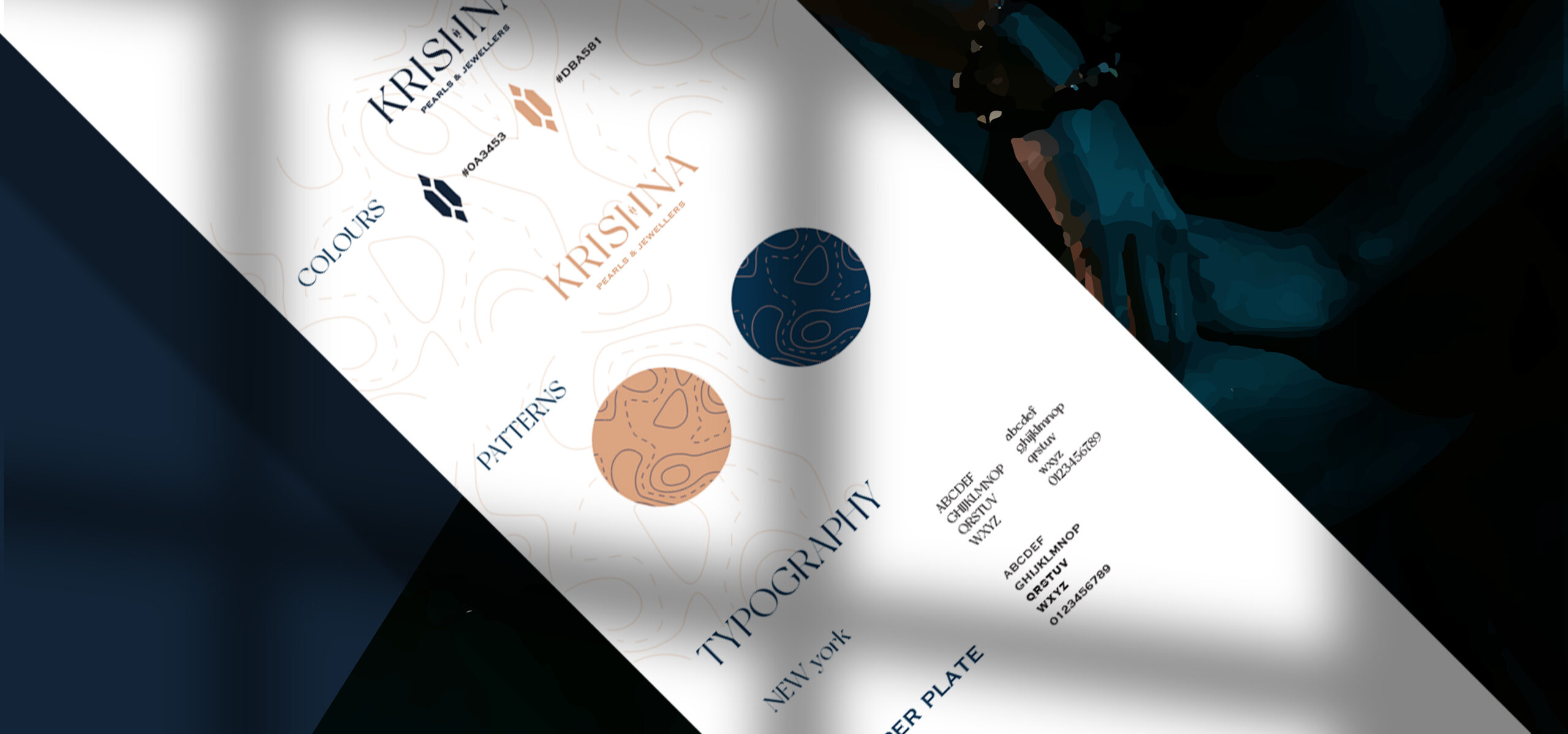
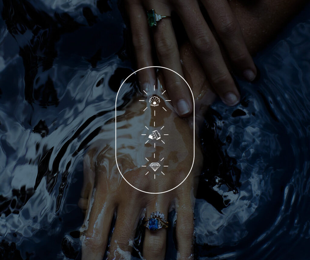
I incorporated my Luxe Framework to establish the brand identity of Krishna Pearls & Jewellers. Our approach to crafting the branding and visual identity involved leveraging the rich Hyderabadi heritage to imbue a sense of authenticity and craftsmanship, reflecting the brand’s keen attention to detail.
Additionally, we designed brand icons to clearly represent the different categories that the brand caters to, facilitating easy recognition and understanding of the brand’s offerings.
We strategically designed a blue colour palette with various hues, symbolizing the brand’s commitment to security and reliability. The various shades of blue help establish a relationship of trust with clients, showcasing the brand’s dedication to delivering exceptional quality and authenticity.
The brand’s typography combines regal and modern fonts, carefully chosen to reflect its personality.